We just recently celebrated the 30th anniversary of the American Disabilities Act, a landmark ruling that affords Americans with a wide spectrum of disabilities and impairments to receive equal accessibility and accommodation in public spaces and buildings, as well as private businesses and services. While this has been a tremendous milestone in assisting all Americans to freely navigate through the physical world, the application of ADA compliance on how it pertains to the digital sphere continues to be a work in progress.
With web traffic skyrocketing the past decade and many businesses moving primarily (if not all together) to a virtual marketplace, there has been a renewed conversation on what constitutes the criteria of being ADA compliant. Over the past few years there have been some high profile examples of iconic brands being sued for ADA non-compliance (Nike, Amazon and more). This has led to some understandable confusion on behalf of small and mid-sized business owners who are unacquainted with ADA compliance and how it could potentially impact them.
You may be familiar with the term ADA compliance, but unsure what exactly it means regarding your website. This is not uncommon. In fact, the overwhelming majority of websites are not up to ADA standards, and most are unaware of their non-compliance.
To understand how ADA compliance relates to websites we need to review the original language of the document. The American Disability Act states “all places of public accommodation” must be made accessible for those with disabilities. 1990 was before the explosion of the internet in the current Information Age, but the law has come to interpret the operative word ‘public’ to extend to the digital domain.
Nearly 22 percent of Americans are classified as having some degree of mobility impairment, or a condition compromising their ability to hear or see properly. Ensuring that your site is accessible to all users, and properly set up to be screen-reader compatible, is not just a legal requirement in 2021, but ethically, creating a space welcoming for all people is the right thing to do.
If you are in the financial, medical, or similar industries that require the input of sensitive information or the exchange of money it is imperative to be ADA compliant. Here are some examples of making your site ADA compliant, and the necessary steps to take to prevent a lawsuit of non-compliance.
Fonts:
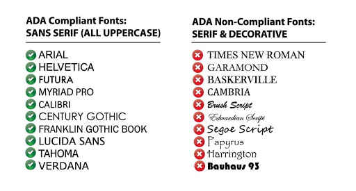
When establishing brand standards it is important to select a font that is common, clear and can be processed through a screen reader. Fonts that are embellished or too stylized can obscure an individual’s ability to read with clarity. Second, someone who is using the assistance of a screen-reader may come across an uncommon font that the program is not equipped to read. Here are a few examples of fonts you will want to use and others to stay far away from.

Contrast:
Similar to font selection, using colors that provide adequate contrast is an important design decision. Poor contrast will make it difficult for many individuals to read content on a website. Additionally, some color combinations cannot be processed with individuals with certain color blindnesses. Work with a designer to make sure the visual and structural elements of your branding and website have the proper contrast. Below are some color tandems that provide an idea of what will work and what will not work.

Forms:
Whenever there are areas on your site for users to input information be sure to provide ample direction for what to do, and what information is necessary for each entry field. A person relying on audio directions will need the requisite queue of what to do. Otherwise, forms can become confusing and frustrating, leaving potential users feeling alienated.

Alt Text:
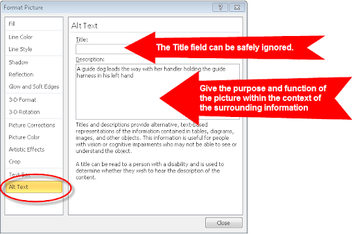
Properly label all content, images, and modules on your website. Use the correct formatting and be descriptive of what is on a given webpage. Remember, someone who is using the assistance of a screen reader will be relying on an image to be properly labeled in order for the message to be conveyed. See below:

Open in a new window:
Anytime your site leaves your site to an external third party, or there is a link that opens into a new tab or screen, this needs to be properly labeled to inform a person using a screen reader that they will be leaving the site. As best practice, try to use the ‘open in a new window’ functionality as little as possible.

WAVE Tool:
Above are just a number of examples of how you can make your site to be ADA compliant, but there are many more items beyond these and it will depend on the scope and complexity of your site. Take advantage of WAVE, Web Accessibility Evaluation Tool, to run a diagnostic of your website and see how your site measures up on ADA compliance. WAVE will return an overall score, as well as address areas that are problematic and how to improve them.

AccessiBe:
ADA compliance is difficult, even for the most well-intentioned of folks. Fortunately, there is software that can seamlessly integrate into an existing website that will allow users to navigate your website with an abundance of tools. AccessiBe is the premier provider of web accessibility options. It will install a control desk on your site that any viewer can adjust the formatting, color scheme, sizing and more. It can provide auditory directions and it is fully compatible with screen readers. Explore if AccessiBe is the right option for your business.


